The guide to effective marketing communications

At Ajax, we're passionate about our brand no less than helping our partners build a successful business.
And we understand that it is critically important to have concrete tools that help communicate the idea to the target audience. This guide compiles marketing materials, templates, and recommendations on applying the Ajax brand identity. Use them in creating effective ads to reach your customers and bring the boldest commercial ideas to life.

Responsible Use

Mentioning Ajax

The correct spelling of Ajax brand and company name:
Brand name: Ajax
Company name: Ajax Systems
Do not type either one in ALL CAPS.

Difference with Ajax Systems

We have the same goal but different communication strategies.

Make your brand names, domains, and social media distinct from those that belong to Ajax Systems.

When communicating with your clients, avoid using materials that may mislead them and create an impression that you are a manufacturer of Ajax products.

Where not to use Ajax company, brand, and product names:

  • in your company name
  • in the names of your products
  • in domain or subdomain site names
  • in social media account handles or names
  • in any other branding or source-identifying materials

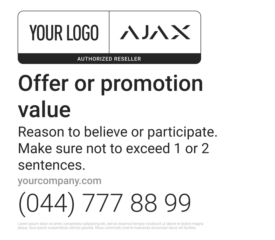
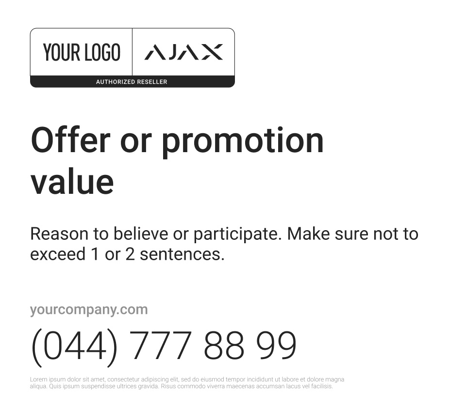
Clearly indicate the Ajax partner status on your website, in marketing materials, and other communication channels.

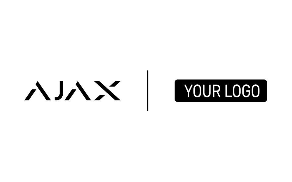
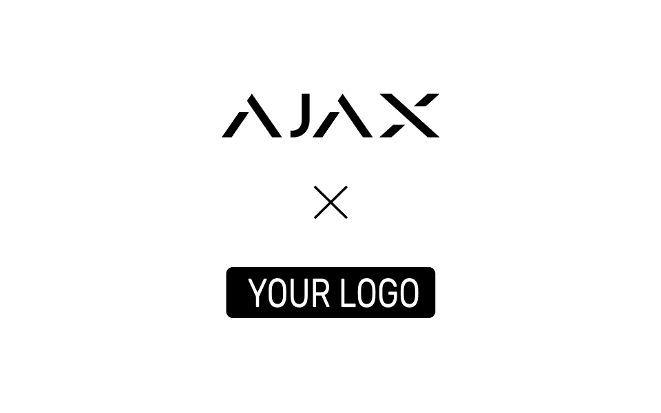
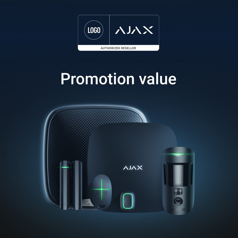
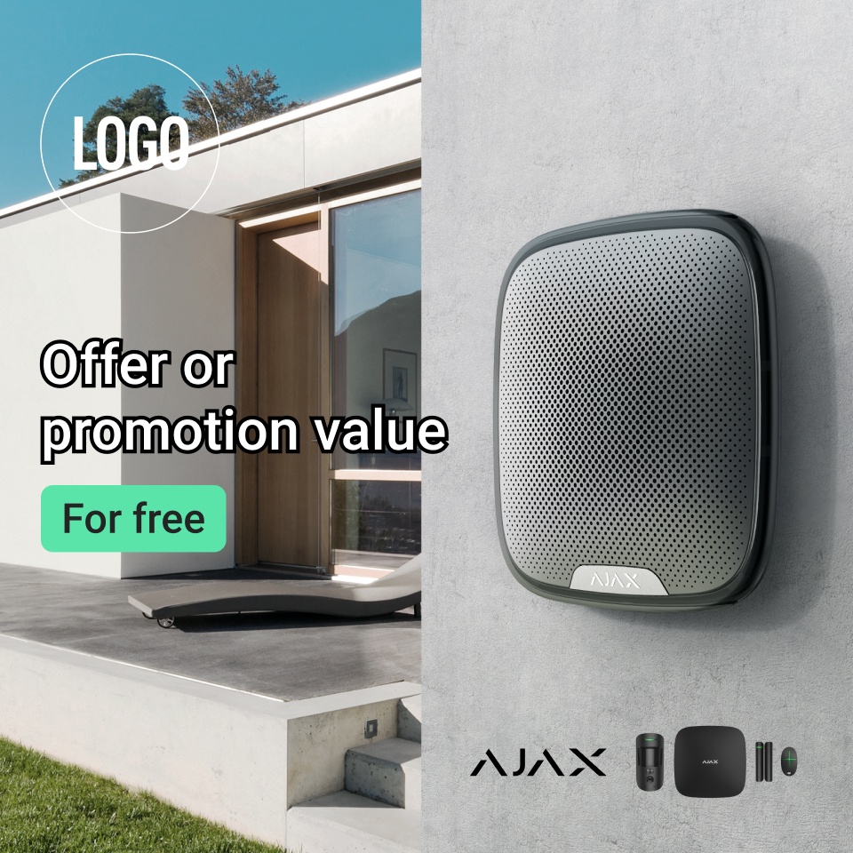
Use the co-branding logo and partner tag on your website, in marketing materials and other creative assets.

Using Ajax in your company name

Using Ajax in domain names

Do not register domain and subdomain names that include Ajax company and/or its product names, or anything similar that may mislead your customers.

If you’d like to use the word "ajax" in the url, make it part of your URL path.

Using Ajax in social media accounts

Indicating Ajax partner status

Use an applicable Ajax partner status that represents your actual and confirmed relationship with Ajax Systems:
The use of made-up partner statuses is prohibited:
Do not alter the naming of partner tags. Do not change the design of any official templates

Using the Ajax content on your website

Avoid plagiarism. Do not copy and paste texts from the official Ajax website. Otherwise, you risk lowering the search engine ranking of your website. Use plagiarism checkers to create a text that is at least 75% unique.

Don’t try to repeat the design of the Ajax official website completely. Instead, use it as a reference.

Using and referencing Ajax videos

Create original videos featuring Ajax. Or share and embed the ones available on Ajax YouTube channels.

Do not download and re-upload any of the Ajax official videos to your websites and social media, partly or entirely.

Using and referencing other creative assets

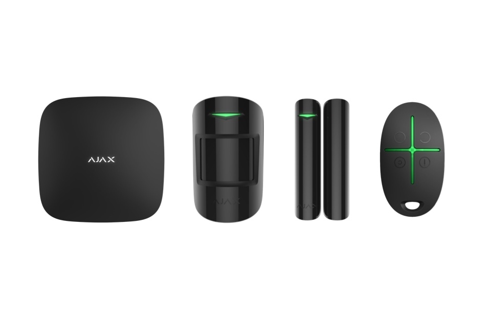
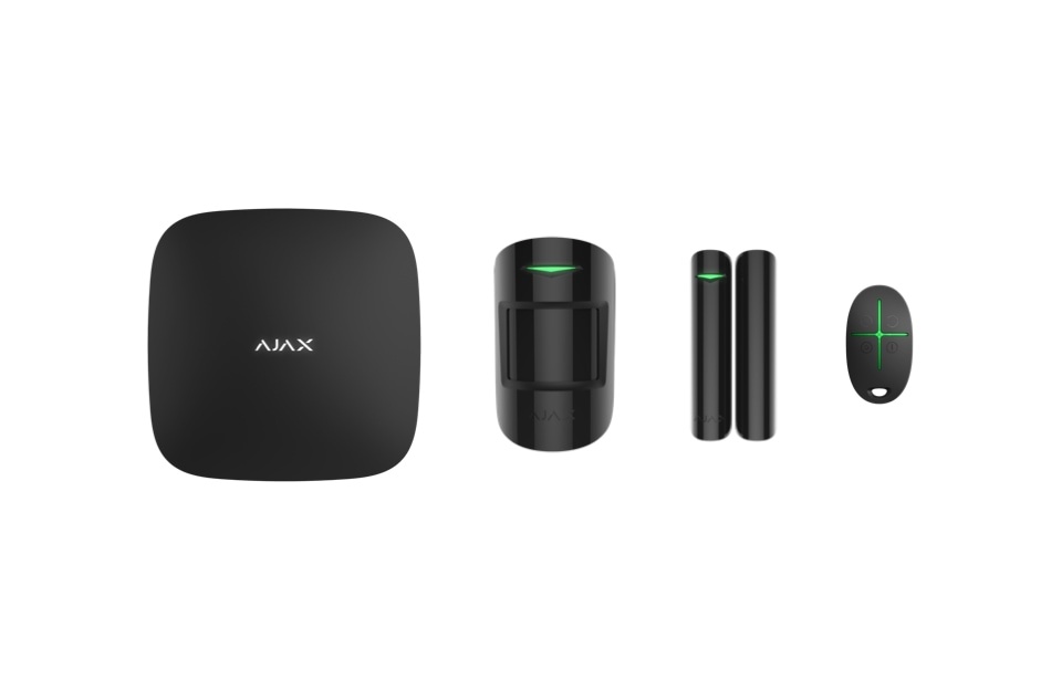
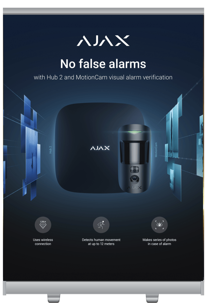
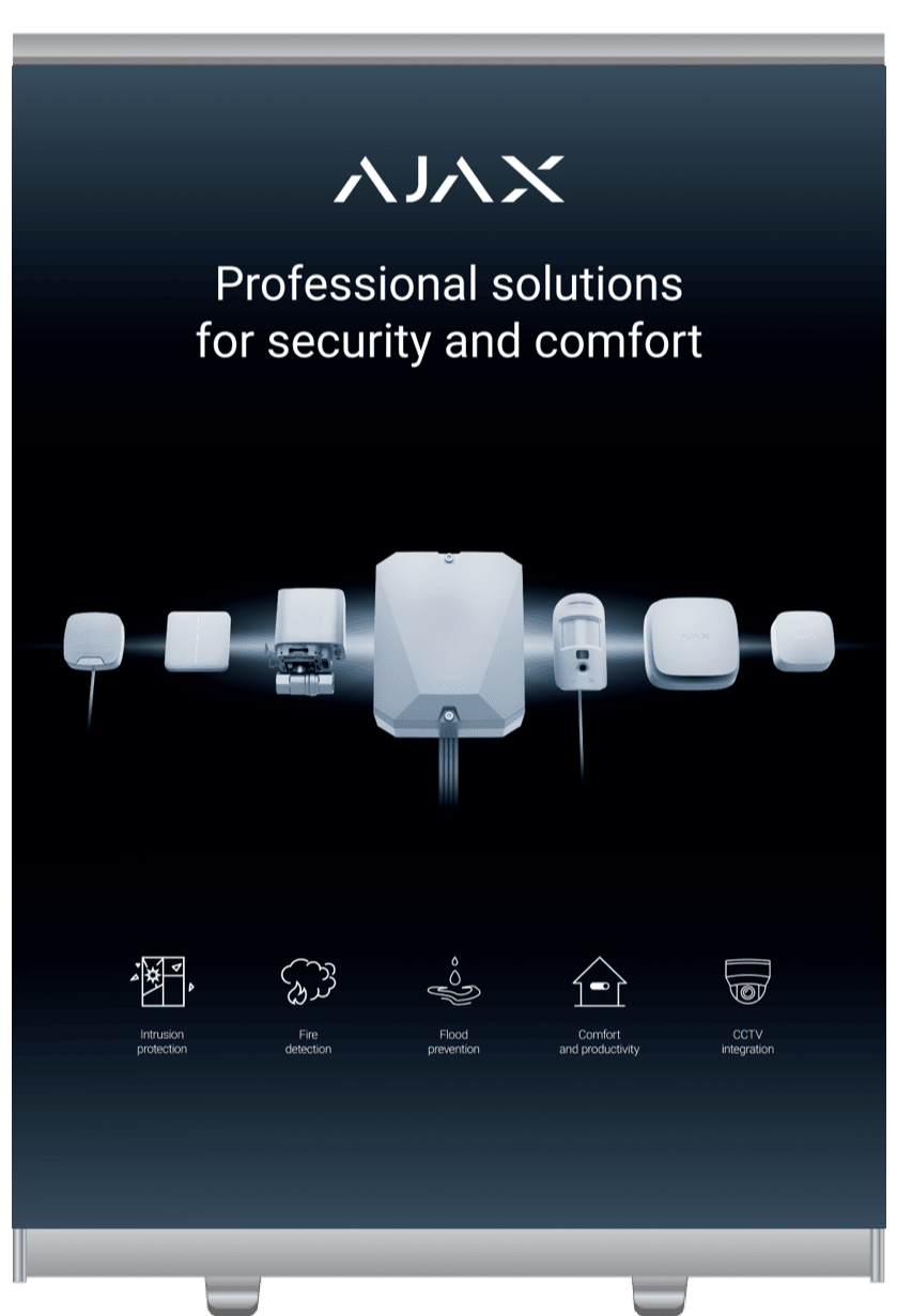
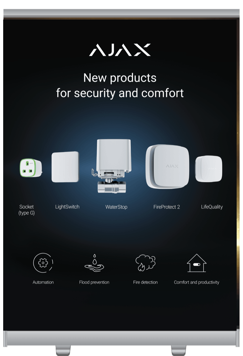
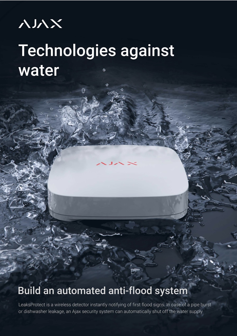
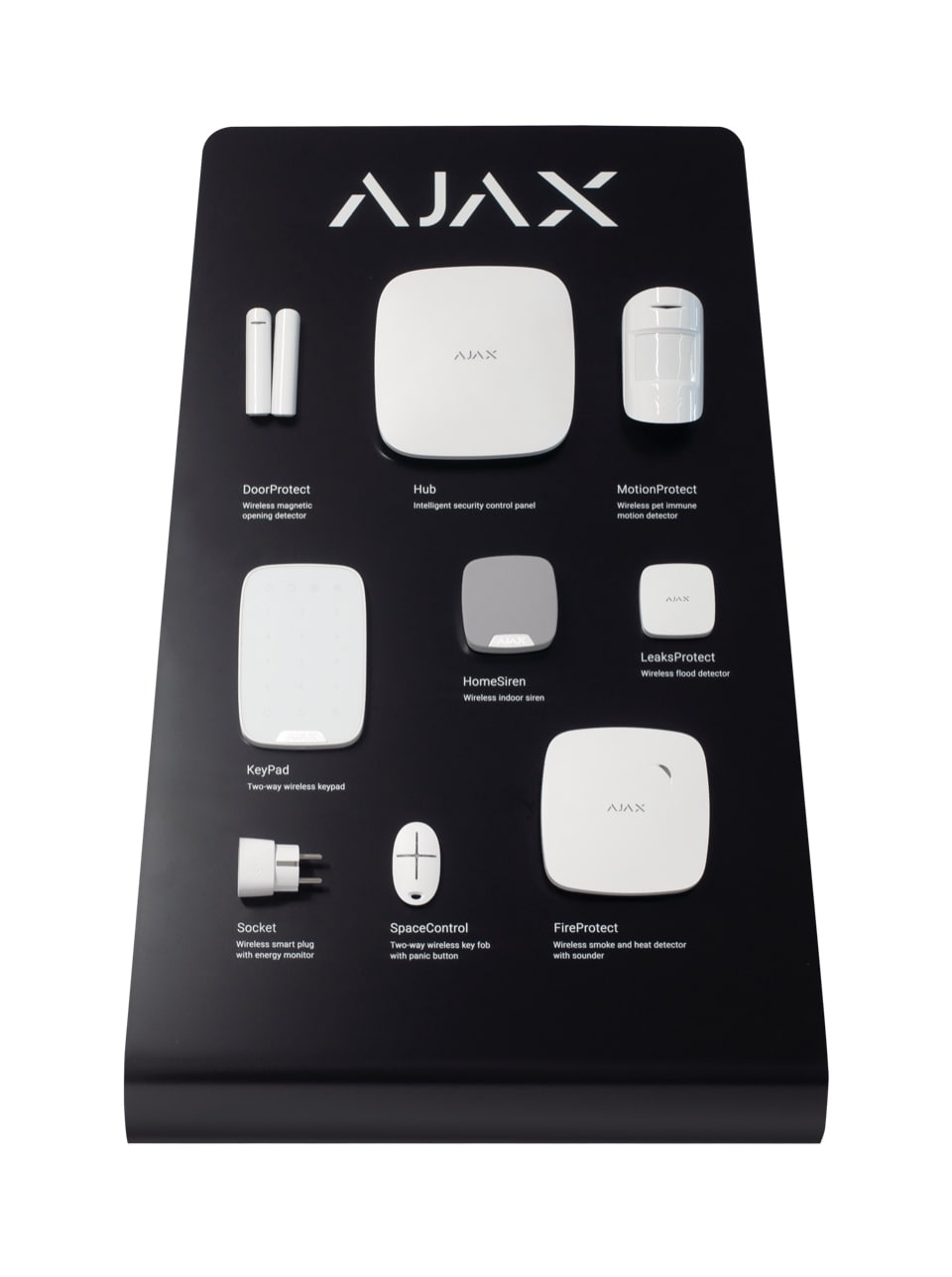
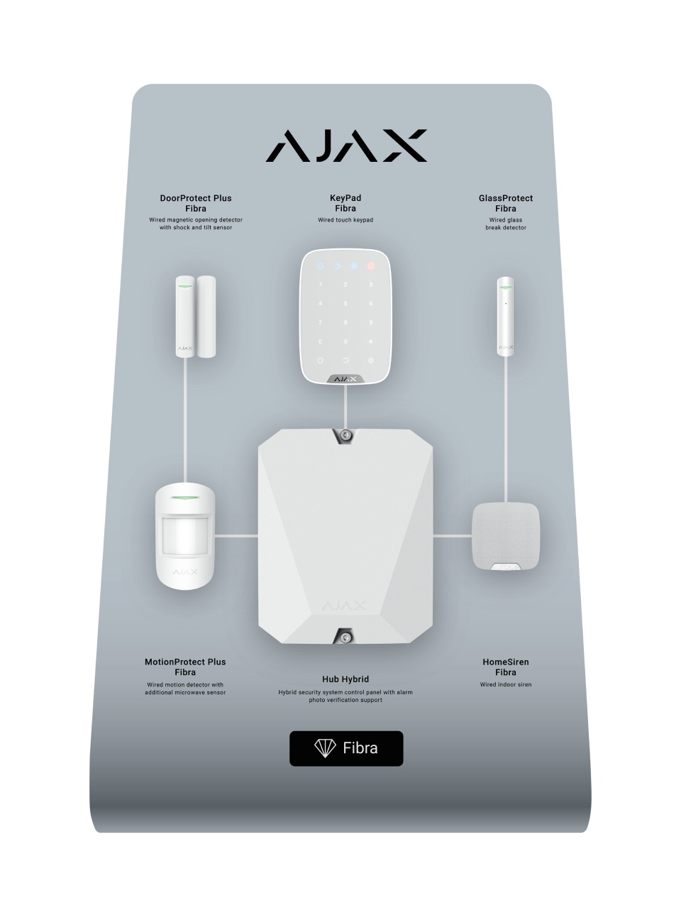
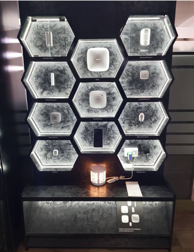
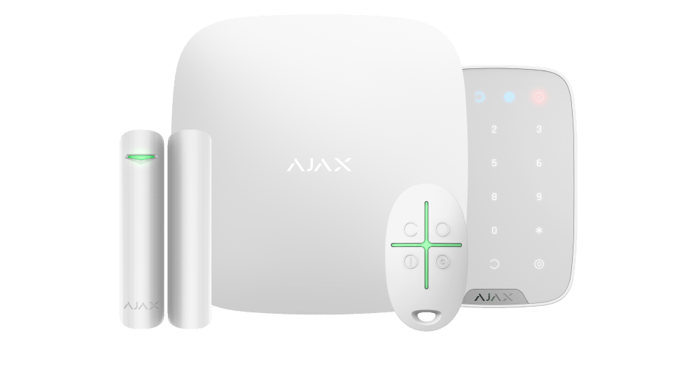
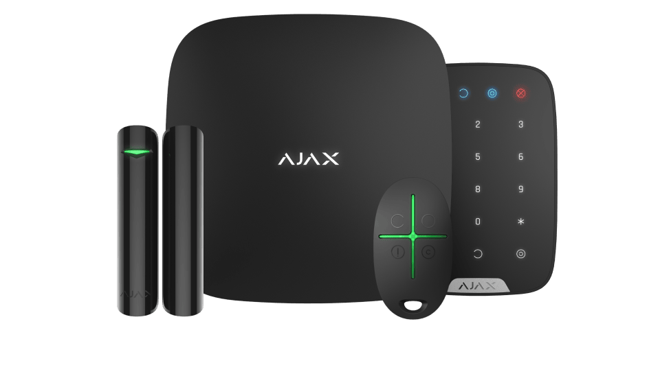
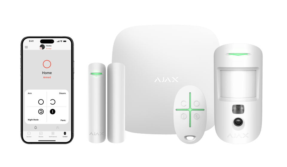
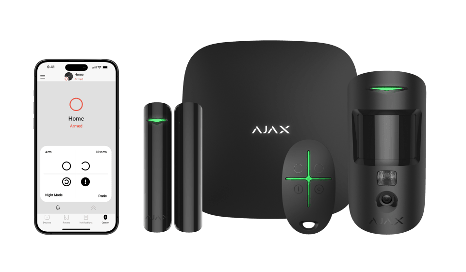
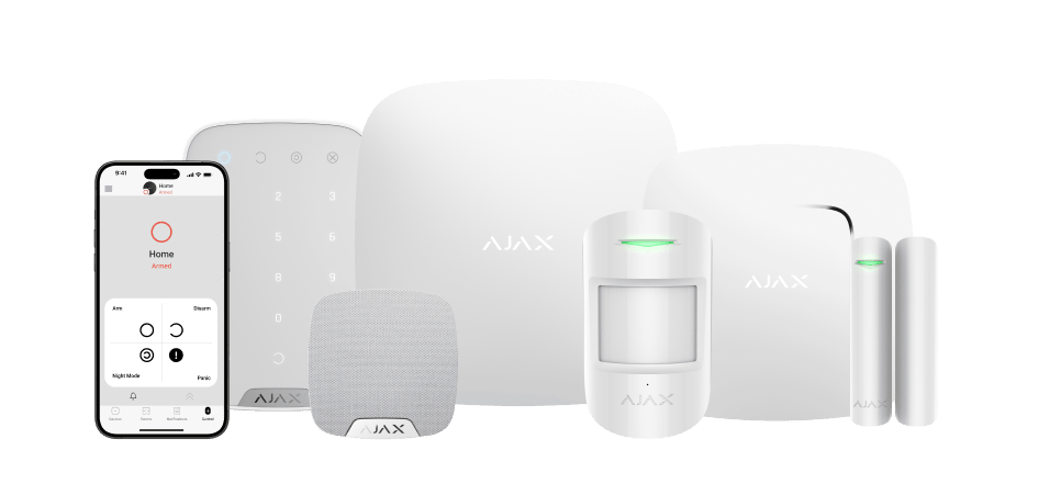
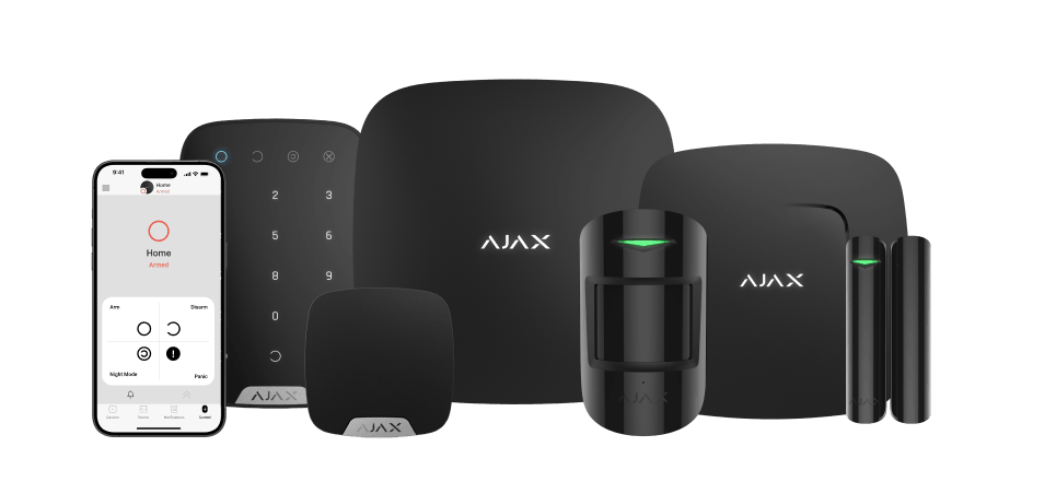
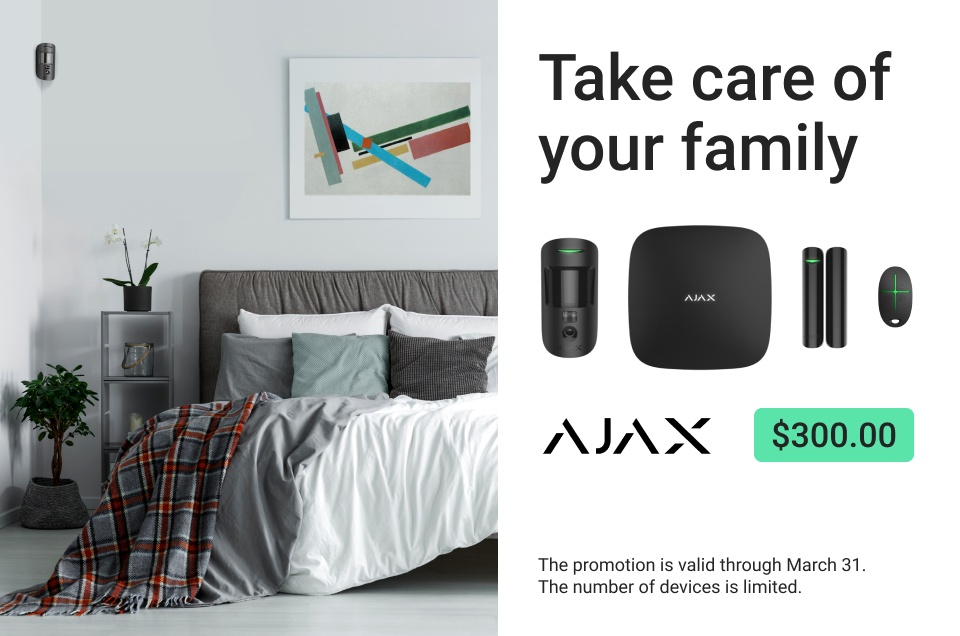
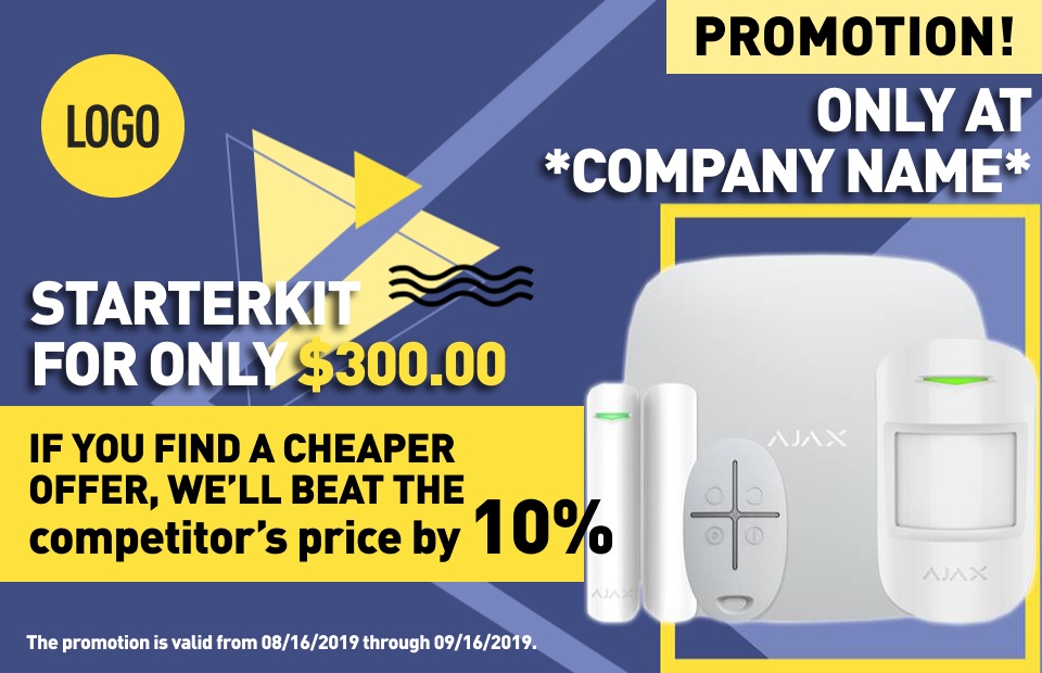
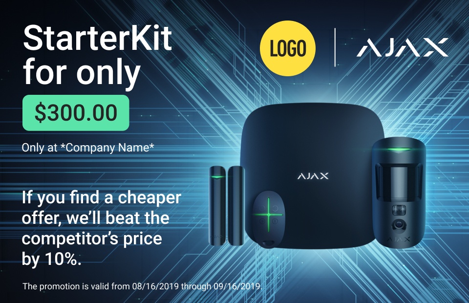
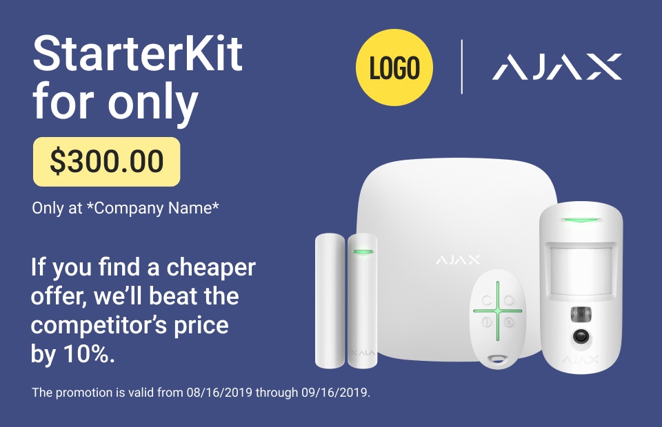
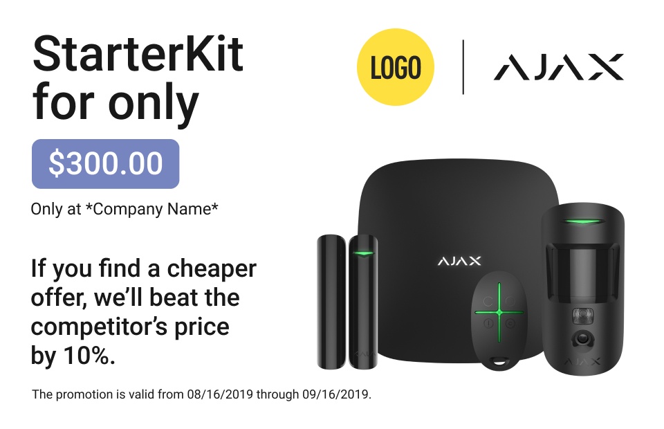
We’ve prepared a library of graphic content for all Ajax devices. It is located in the Google Drive library. Having a partner status, you can use images from this library for your website. Get creative with them to produce your marketing content, but remember to follow the brand guidelines.

Adding changes to Ajax materials

If you want to add changes to our templates, graphic materials, and visual assets, please contact us for approval.

How to talk about the product

Strongly

Give a good reason to believe in the product and want it. Always explain “why Ajax” and talk about its benefits in plain language:
What makes a product desired and meaningful? Present Ajax through its value for the audience and confirm it with clear real–life examples:

Calmly

Ajax is a defender, quiet power. There is no need to make overpromises. Persuasively, speak only about the real benefits of the produc.
Calm does not mean dull. Use irony. Don't be too serious, look for figurative comparisons:

Precisely

Ajax is known for a balanced, clear, and concise design. Perfect engineering solutions create a valuable and complete product.
Be an engineer in your communications. Cut off the excess and find the right arguments. Choose the formats that best solve the problem: text, graphics, and video.
Listen carefully to the client and find out their needs. Respond to them with a precise, expert message that hits right on target:

And finally,

Use the content from ajax.systems. This is your assistant when choosing the most bright and effective arguments.

Logotype

Main logo

Place the logo on a clear background: white, black, or light gray.
Leave free space around the logo.
Do not change the color, size, or shape of the logo. Also, do not use additional visual effects.

Additional sign

Place the sign on a clear background: white, black, or light gray.
Do not use additional symbols with the main logo.

Logo + tagline

We cover security and comfort, fire safety, water-leak prevention, and video. All are automated and integrated. We give you total control over all your locations. So Ajax tagline is Rule your space. Without any borders. It signifies the empowerment and freedom to customize and dominate any area with Ajax solutions.
The following tagline can be used with the main logo. We've designed a unique font to capture the essence of our tagline. It is available exclusively upon request.

Partner branding logo

Combine your logo with the Partner Ajax logo using these templates:
Use a co-branded logo when you want to emphasize your partnership with Ajax Systems or your partner status. For instance, on the visuals for co-marketing campaigns.

Product line logos

Baseline is a product line of wireless Ajax products. It comprises wireless devices to protect properties from intrusion, fire, water leaks, as well as CCTV. It contains indoor and outdoor solutions. Automation tools focus on comfort, in particular monitoring air quality, and controlling all kinds of appliances and lighting.
Products for projects
Superior is a product line of wireless devices. It focuses on intrusion protection devices. The product line has international compliance and important local certifications. Only accredited Ajax Systems partners can sell, install, and administer Superior products.
Fibra is a product line of wired devices. It comprises wired devices designed for intrusion protection. Only accredited Ajax Systems partners can sell, install, and administer Fibra products.
Each product line has its own logo.
Place the logo on a clear background: white, black.
Leave free space around the logo.
Leave X letter space between the logo Ajax and the product line logo.
Do not use default co-branded lines between the logo Ajax and the product line logo.
Do not use product line logo and your logo co-brand.

Logomark

Place the logomark on a clear background: white, black.
Do not change the color, size, or shape of the logomark. Also, do not use additional visual effects.
Do not use logomark with the main logo.

Ajax technology logos

OS Malevich

A real-time operating system for Ajax hubs and range extenders.

Ajax Cloud

A cloud server that ensures communication between security systems and the Ajax apps, alarm transmission, and OS Malevich updates.

API

A tool to integrate Ajax products with third-party apps, services, billing and CRM systems.

Jeweller

A secure two-way radio technology for communication between Ajax security system devices.

Fibra

A protocol to ensure fast and secure two-way wired communication between the hub and connected devices.

Wings

A two-way radio technology for transmitting images from MotionCam motion detectors with visual alarm verification to the hub.

Ajax Translator

An app to establish communication between Ajax security systems and third-party monitoring software. Ajax Translator converts the notifications received from hubs into event protocol supported by the CMS software.

LISA

A two-step algorithm for performing correlation and spectral analysis of the signals, which helps to instantly distinguish real threats from interferences.

ZOE

An algorithm for analyzing the data by comparing the parameters of the signals.

ELSA

An algorithm for performing a three-step signal analysis.

HazeFlow

An algorithm for verifying smoke presence in fire detectors.

HazeFlow 2

An algorithm for verifying smoke presence in fire detectors.

SmartDetect

A digital algorithm for filtering false alarms of motion detectors.

Logos of Ajax apps

Color

Color proportions

Main colors

Light

1
#F7F7F7
2
#EDEDED
3
#DBDBDB
4
#C7C7C7

Middle

1
#ADADAD
2
#919191
3
#787878
4
#5E5E5E

Dark

1
#3B3B3B
2
#303030
3
#242424
4
#181818

Green

1
#5AE4AA
2
#1DCF8E
3
#00AD74

Black and white

White
#FFFFFF
Black
#000000

Additional colors

We use an additional color palette for color coding only. This technique helps visually differentiate any uniformly shaped objects. It also makes it easier to read graphic information and use complex interfaces.

Red

1
#FF725C
2
#EA5949
3
#C9423B

Yellow

1
#F8DF52
2
#F5CA1B
3
#DAB00A

Lime

1
#ADF75E
2
#97DE4B
3
#80C23A

Blue

1
#3AD4F2
2
#11B2DF
3
#1083AD
Examples of color coding:

Font

Typography

We use the Roboto font. It has five styles: Thin, Light, Regular, Medium, and Black. They are sufficient to build a visual hierarchy without having to use any additional fonts.
Imagine that the text is music and the lines are notes. You may get bored listening to such a melody:
To make a vibrant text, you should combine large and small fonts, as well as thin-lined and bold. Build a hierarchy of relationships between the primary and secondary parts of your message.

How to construct a type hierarchy

Let’s consider several combinations.

Trio

When there is a heading, a subheading, and a body text.

Duo

When there is a heading and a body text.

What you should not do

Do not color or apply any effects to the text.

How to install fonts

Windows

  • Download Roboto font family (.zip)
  • Uncompress the archive
  • Search for “fonts” in the Start Menu or go to Start → Control Panel → Appearance and Personalization → Fonts
  • Drag Roboto fonts into the Fonts folder

macOS

  • Download Roboto font family (.zip)
  • Double click on the archive to uncompress it
  • Open Font Book (Go to Finder → Applications → Font Book)
  • Select all of the font files and drag them to the Font column (i.e., the second column) of Font Book

Device Information

How to use device images

Depict the devices on a clear background: white, black, light gray.
Do not change the colors
Do not change the shape of the image
Do not place objects on top of the devices
Do not place the devices on top of photos
The devices can be covered with a badge, but do not cut the logo on the body.
When depicting multiple devices, observe their proportions.

Correct proportions of Ajax devices

Hub

StreetSiren DoubleDeck

LeaksProtect

DoubleButton

MotionCam

Hub Plus

MotionProtect Outdoor

HomeSiren

SpaceControl

MotionProtect

MultiTransmitter

MotionCam Outdoor

DoorProtect

MotionProtect Curtain

CombiProtect

StreetSiren

DualCurtain Outdoor

GlassProtect

KeyPad Plus

Socket

Brandplate

FireProtect

Button

KeyPad

WallSwitch

LifeQuality

FireProtect 2

Transmitter

Pass

12V PSU for Hub/Hub Plus/ReX

WaterStop

FireProtect 2

LightSwitch

Tag

12-24V PSU for Hub 2/Hub 2 Plus/ReX 2

Device name spelling

Do not modify device names

Printed Matters

All materials are ready to print. To facilitate your communication with print shops we’ve also included technical briefs. For products that are difficult to print we’ve provided photos and videos of how the final results should look like. Partners can use web versions of the materials for online communications: email campaigns and social media publications.

You can review and order these and other printed matters using the catalog. Or print them yourself.

Roll up banners

Posters

Handouts

PRO leaflet

Size 210 mm x 210 mm

Merchandise products

You can review and order these and other merchandise products using the catalogue. Or make them yourself using layouts.

T-shirts

T-shirts

Sweatshirts

Hoodies

Caps

Baseball bats

Badge bands

Paper bags

Rolltop backpacks

Brand Zones

If you need demo stands for stores, show rooms, and offices, you can order them from us using the catalogue. Or make them yourself. Look for printable templates in the catalogue.

Wall display stands

Table display stands

Branded case

Exhibition stands

Showroom stands

Ajax Design Recipe

To create a design that works, you need to adhere to just a few simple principles.

Hierarchy and three levers of influence

Imagine that you don’t have any colors, effects, shadows, or pictures. All you’ve got is a font and a black and white palette. How to design a vibrant, yet budget-friendly layout?

For the design to work, you need to learn how to manage the viewer’s attention. The rule is simple: the most contrasting objects will be the first to draw attention. We’ll use size, brightness, and thickness to control contrast.

1. Size

The larger the object, the quicker we notice it.

2. Brightness

The lighter a text against a darker background, the sooner we notice it.

And vice versa: the darker the text appears against a lighter background, the more attention it draws.

3. Thickness

The bolder the font, the greater its visual weight.

These three simple tools are commonly viewed as the levers through which we regulate the hierarchical relationships between objects.

By applying these imaginary levers, we can construct a message.

Message components

To create designs we use blocks referred to as "components". In this tutorial, we have marked each component with #.

First, we want to draw attention to the product and, by using vivid illustrations, generate initial interest. We refer to the principal image as #keyvisual.

#Keyvisual

#Keyvisual conveys the gist of the promotional message and imprints the image in the viewer’s memory by stirring up their emotions. #Keyvisual showcases the special properties of the product or tells its story. Our target audience loves beautiful gadgets, and a single image of an Ajax device may at times be sufficient to generate aesthetic excitement and interest. We should allocate about 40% of the layout area for the image.

Now, let’s construct the information hierarchy.

#Value

Let’s first consider the most important thing: What is the value of our offer?

For instance: Get a free StarterKit.

Or: Forget about having to replace batteries for a long time.

We view #value as the highest priority in the information hierarchy; so, we’ll turn up all the three levers to the maximum:

#Co-branding

It is important for us that the viewer knows where the offer comes from. So, let’s add #co-branding — company logos. Slightly smaller than the value.

#Call-to-action

At this stage, the viewer may be ready to take our offer. But how can they do that? Here, we need to provide our contacts. The phone number should be big, but it shouldn’t outweigh the #value. Let’s lower its priority by decreasing its weight.

#Reason-to-believe

This is where we demonstrate our value or explain what our offer is about. For example, if the #value were “Forget about having to replace batteries for a long time", the #reason-to-believe would be:
We have worked hard to create Jeweller radio protocol. It saves energy, and our devices operate from bundled batteries for up to 7 years.

Or, if the #value is, “Get a free StarterKit”, we can detail our promotion. For example
If you connect to the ARC for a year, you’ll get a free smart wireless security system.

#More

Before calling us, the viewer may want to learn more about our company. So, let’s place the website address on the layout. This will be the 6th position in the hierarchy. We’ll decrease its size and brightness — but use the maximum text weight to improve its readability.

And finally, let’s add the proprietary information, which no one reads except the regulatory authorities. Let’s decrease all its parameters to position it at the bottom of the hierarchy.

Done!

What else to consider

Let it breathe

Do not try to take up all the free space with your information; add extra line spacing between the logical blocks.

How to highlight a promotion

Use a #promo-badge like this:Promotion
Place it in a free space.

Do not place the #promo-badge on devices and do not use colored fonts.

Horizontal text Only

Do not flip the lines in any direction; all the text should be typed from left to right.

Use contrasting images for printing

Avoid using dark-colored devices against dark backgrounds or white-colored devices against light backgrounds. This is especially true for outdoor advertising. The image may look good on screen, but it will lose its contrast when printed.

Design Builder

Components

In this section, we will continue exploring the #Components and check the examples of their use.

Components are the parts that we use to build designs. Some of them are described in the Design Recipe:
#Keyvisual
#Co-branding
#Value
#Reason-to-believe
#More
#Call-to-action
#Promo-badge

Let’s take a look at a few more components:
#Set-of-devices
#Mini-set-of-devices
#Content-field
#Dimmer

#Set-of-devices

These components are used when a set of devices is a key visual element in the layout.

Example of using a #Set-of-devices

#Content-field

This is a clear, black and white space that separates the content from the image. It’s useful when there is a lot of information, and it does not overlap with the image.

Examples of using a #Content-field

#Dimmer

This semi-transparent component enhances the readability of any text typed over an image.

Examples of using a #dimmer

No dimmer
With a dimmer

Types of layouts and how to use them

Lifestyle

If you want to use an interior design image in your layout, follow these principles.

Do not place your devices on top of the image.

Devices need some space, and, when placed on top of an interior design image, they look out of place. For such layouts, use #set-of-devices and #content-field.

What NOT to Do

Use lifestyle images from our library.

We have interior design images for any occasion.

A set of devices against an abstract background

When creating such layouts, be sure not to overload the layout with graphics to keep the text readable and maintain a clear hierarchy: what is primary and what is secondary.

The hierarchy of primary and secondary elements is not clear: the elements conflict with each other, and it’s hard to decide where to look first.
A #keyvisual from the library is used; a hierarchy of elements is maintained.
You don’t always need to use background graphics; just arrange the elements according to the Ajax Design Recipe. You can always make your brand stand out with background colors and your #promo-badge.